Today, whenever your average person thinks about the creation of a website or application, more complex languages like Javascript and Python are top of mind. However, these languages and their frameworks are a bit too complicated for beginners, especially when they’d only like to build simple websites, like portfolios, or static responsive websites, like landing pages.
HTML and CSS to the rescue! For the newbie or average developer who wants to create a portfolio website but isn't very excited about the complex ideas that come with other programming frameworks, HTML and CSS are great. They allow you to create your websites with HTML and improve or style them with CSS. Of course, you can build things with them other than a portfolio, including:
Interactive resumes
Email newsletters
Forms
Animations
Contributions to an open-source project
This article focuses on learning how to build a functional portfolio using HTML, CSS and Bootstrap that looks great regardless of the device used to display it.
The Tools You’ll Use
To be able to work on a portfolio with these tools, you at least need to be familiar with how they each work. This section will shed a bit of light on getting started if you haven't used them before or refresh your memory from past projects.
HTML
HTML, or Hyper Text Markup Language, is the standard markup language for Web pages. HTML consists of elements that tell the browser how to display the content. In a nutshell, we use HTML to define the building blocks of web pages.
CSS
CSS, or Cascading Style Sheets, is a programming language used to style web pages and HTML. It describes how to display HTML elements. We’ll leverage the Bootstrap CSS style to make development faster.
Bootstrap
Bootstrap is a toolset for the front end and includes features that you can use to style nearly anything.
Building a Portfolio
Folder and Files
You can get the starter files for this project on GitHub. To create the folder structure and access a live demo of the project, visit here.
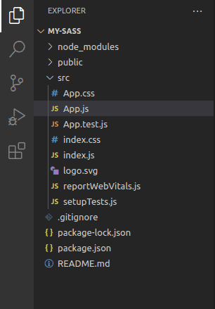
This is the project folder structure:
📦portfolio
┣ 📂css
┃ ┣ 📜bootstrap.min.css
┃ ┗ 📜styles.css
┣ 📂img
┃ ┣ 📜Cover 1.png
┃ ┣ 📜Rectangle 7.png
┃ ┣ 📜dev-Vector.png
┃ ┗ 📜emojione_pen.png
┣ 📂js
┃ ┗ 📜bootstrap.bundle.min.js
┣ 📜H1.svg
┣ 📜H2.svg
┣ 📜Messgae.svg
┣ 📜Vector.svg
┣ 📜development.html
┣ 📜index.html
┗ 📜writing.html
This folder structure comprises a CSS folder containing styles.css
and bootstrap.min.css
files, an image folder with .png files, and a JS folder with a bundle.min.js
file. The rest of the folders are individual .svg files and .html folders.
The HTML Header
Add the following code to the index.html file head section:
<!DOCTYPE html>
<html lang="en">
<head>
<meta charset="utf-8">
<meta name="viewport" content="width=device-width, initial-scale=1">
<link rel="stylesheet" href="css/bootstrap.min.css">
<link rel="stylesheet" href="css/styles.css">
<link rel="stylesheet" href="https://cdnjs.cloudflare.com/ajax/libs/font-awesome/4.7.0/css/font-awesome.min.css">
<title>Goodness's portfolio</title>
</head>
It has a locally served Bootstrap, a font awesome kit and a link to the external style sheet inputted in the boilerplate.
The script file will be added to the body, right after the header closing tag.
The Nav Bar
Let’s move into the body, where we first create the navbar
:
<body data-bs-spy="scroll" data-bs-target=".navbar">
<nav class="navbar fixed-top navbar-expand-lg navbar-light bg-white">
<div class="container">
<a class="navbar-brand logo-text" href="#">Greén.</a>
<button class="navbar-toggler" type="button" data-bs-toggle="collapse" data-bs-target="#navbarNav"
aria-controls="navbarNav" aria-expanded="false" aria-label="Toggle navigation">
<span class="navbar-toggler-icon"></span>
</button>
<div class="collapse navbar-collapse" id="navbarNav">
<ul class="navbar-nav ms-auto">
<li class="nav-item">
<a class="nav-link active" aria-current="page" href="#home">Home</a>
</li>
<li class="nav-item">
<a class="nav-link active" href="development.html">Development</a>
</li>
<li class="nav-item">
<a class="nav-link active" href="writing.html">Writing</a>
</li>
<li class="nav-item">
<a class="nav-link contact" href="#contact">Contact</a>
</li>
</ul>
</div>
</div>
</nav>
</body>
The nav bar allows visitors to find the appropriate information they're looking for.
We will use Bootstrap's fixed-top
class in the nav element to keep the nav bar at the top of the page even when a visitor scrolls. The nav bar also has a navbar-brand
and logo-text
brand where we keep the person's name as a branding element.
This nav bar contains several features:
Links to the Home page, Development page, Writing page and Contact page
The ability to toggle on smaller devices
You can learn more about the nav bar in this Bootstrap documentation.
Next is the styling of the nav bar and logo text:
@import url("https://fonts.googleapis.com/css2?family=Balsamiq+Sans:wght@400;700&family=Lilita+One&family=Montserrat+Alternates:wght@600;700&family=Poppins&display=swap");
html, body {
overflow-x: hidden;
}
body {
background-color: #fff;
position: relative;
}
section {
padding-top: 100px;
padding-bottom: 100px;
}
form small {
font-family: "Poppins";
font-weight: 400;
}
.navbar {
border-bottom: 1px solid rgba(0, 0, 0, 0.1);
}
.logo-text {
color: #1ea896 !important;
font-family: "Lilita One";
font-size: 38px;
}
.navbar .nav-link {
font-family: "Montserrat Alternates";
}
.navbar-light .navbar-nav .nav-link.active {
color: #ff715b;
}
This code snippet shows the styling of the nav bar in styles.css.
A link to the Google fonts with the preferred font families and weight for the project is provided in “line 1”. This link is the basis for all of the text in this project.
The Hero Section
<section id="home">
<div class="container text-center top-container">
<div class="row justify-content-center">
<div class="col-md-10">
<h5 class="text1">Hello I'm</h5>
<h1 class="text2">Goodness Green</h1>
<h5 class="text3">Frontend Developer/Writer</h3>
<a href="#contact" class="btn btn-brand">Contact Me</a>
<br>
<img class="home-img col-md-6 col-xl-5 col-12" src="./H1.svg" alt="">
</div>
</div>
</div>
</section>
This section contains the introduction of the page, and it comes with an image that is mainly referred to as a “hero image.” This section displays your primary goals. A representative image, photo, or another eye-catching element will help attract users to your site. This section was given an Id
called home. A short introductory text with your name and what you do should be here, too. In this project, we will use an SVG file for the image with a short bit of text in the center and a "contact me" button that will lead directly to the contact form.
The contact button is added with the Bootstrap class btn
. The #contact
on line 8 references it to an Id
. In this case, the Id
is the contact Id
, which makes the button direct you to the Contact page when clicked (this is a section that'll appear in a later stage of this project).
Styling the Hero section:
#home {
align-items: center;
padding-top: 150px;
padding-bottom: 200px;
line-height: 32px;
font-family: "Balsamiq Sans";
}
.text1 {
font-weight: 400;
font-size: 24px;
}
.text2 {
padding-top: 20px;
font-weight: 700;
font-size: 42px;
}
.text3 {
padding-bottom: 40px;
font-size: 24px;
font-weight: 700;
color: #ff715b;
}
.btn-brand {
background-color: #ff715b;
color: #fff;
font-family: "Montserrat Alternates";
margin-bottom: 12%;
}
.btn-brand:hover {
background-color: #dd2f14d8;
color: #fff;
}
From the styling code snippet, it's pretty easy to decipher what happened. For fun, in line 29, a hover animation was added to the button to make it a bit interesting.
The About Me Section
This section is where you give your audience significant details about you and your profession.
<section id="aboutme">
<div class="row">
<div class="col-md-9">
<p>- Who am I?</p>
<h3>A bit about Me</h3>
<p>Lorem ipsum dolor sit amet, consectetur adipiscing elit. Platea dolor adipiscing eget pretium lacus nibh
pulvinar sit. Suspendisse aliquet augue ornare nec rutrum nisi. Eu vulputate tempor, eu lacus. Maecenas
egestas egestas rutrum nascetur facilisi ut ullamcorper enim in. Orci a senectus diam tortor, sodales. Et
dignissim leo, volutpat amet. Amet neque posuere tincidunt mauris mi. Hac diam ultrices vel non suscipit
semper iaculis. Id scelerisque luctus orci, in duis arcu. Sit et, vel venenatis, fermentum urna sem blandit
suscipit. Imperdiet magna vitae feugiat in nibh. Bibendum porta ipsum enim varius orci condimentum.
Auctor tellus cursus vitae, quam vitae volutpat sit eget quis. Fames bibendum vel lorem odio sed ornare sed
lorem. Faucibus donec vel viverra feugiat scelerisque vel nunc tincidunt. Orci integer non maecenas viverra
feugiat odio lectus imperdiet elit. Est vitae vel vestibulum cras amet in malesuada. Viverra tincidunt eget
tellus lorem dis neque pretium. Nec nibh aenean arcu a egestas netus a pulvinar. Tristique vel sit amet duis
massa nullam mi, in euismod. Odio dapibus etiam donec tristique id pellentesque. In duis libero facilisis ac.
</p>
</div>
</div>
</div>
</section>
As you’ve probably noticed, each section starts with an Id
. This section’s Id
name is aboutme
. Also, the row has one column which was set at "col-md-9"
, so that the text wrapper doesn’t take the full width of the page for screens equal to or greater than 768px. You can find more information on bootstrap breakpoints here.
Styling the About Me Section:
#aboutme {
background-color: #1ea89633;
background-image: url("../H2.svg");
background-repeat: no-repeat;
background-size: 60%;
background-position: right;
display: flex;
background-attachment: inherit;
align-items: center;
padding: 5%;
}
#aboutme p {
font-family: "Poppins";
font-weight: 400;
font-size: 16px;
}
#aboutme h3 {
font-family: "Balsamiq Sans";
}
If you look at the live demo version of this project, there’s an SVG image at the right of this section and it was implemented in “line 3” as the background image and styled.
The Case Study Section
This section does all of the convincing and can turn your average web visitor into a potential employer or client. You not only explain your offered services, but also display samples of your previous work here.
Here’s the code description for the section; we’ll take it bit-by-bit.
<section id="case-study">
<div class="row">
<div class="col-12 section-intro">
<h1>Case Study</h1>
<p>A couple things that I have worked on...</p>
</div>
</div>
We have two rows in this section. The first row has the section-intro
. It has one column which is why we used col-12
.
.section-intro {
text-align: center;
margin-bottom: 60px;
}
.section-intro h1 {
font-weight: 700;
font-size: 28px;
font-family: "Balsamiq Sans";
color: #ff715b;
}
.section-intro p {
font-family: "Poppins";
font-size: 16px;
font-weight: 400;
}
The section-intro is styled above: all of the text is centered.
<div class="container">
<div class="row justify-content-around gy-4">
<div class="col-lg-4 col-sm-6">
<div class="case-study-item">
<div>
<h5>Casino Virtue</h5>
</div>
<img class="w-100 h-100" src="./img/Cover 1.png" alt="">
<div class="case-study-overlay">
<div>
<p>Lorem ipsum dolor sit amet, consectetur adipiscing elit. Nisi egestas maecenas augue nibh nibh risus
Lorem ipsum dolor sit ame, consectetur adipiscing elit. Nisi maecenas augue nibh ni</p>
</div>
The above is a container containing the second row, located in index.html. We used the bootstrap flex justify-content-around
to style the second-row X-axis and the gy-4
to give the Y-axis space.In the second row of the case study section, there are going to be three identical columns. col-lg-4
col-sm-6
will make these three columns fit perfectly. The class name case-study-item
is the next thing we’re looking at here. We inputted the text and an image in the center of the card, too. Then, finally, the case-study-overlay
.
This is how the styling of the case-study-item
will go:
.case-study-item {
border: 2px solid rgba(128, 128, 128, 0.185);
border-radius: 8%;
padding: 5%;
position: relative;
overflow: hidden;
}
.case-study-item h5 {
font-family: "Balsamiq Sans";
font-weight: 700;
font-size: 18px;
}
.case-study-item p {
font-family: "Poppins";
font-weight: 400;
font-size: 14px;
line-height: 22px;
}
And here’s how it’ll come out:
But, this section isn’t complete yet! If you check the live version of the project, you’ll notice an animation that displays itself whenever you hover over each of these case studies, like so:
This animation feature is described in the code below.
<div class="overlay">
<div class="overlay-card">
<div>
<svg width="36" height="36" viewBox="0 0 36 36" fill="none" xmlns="http://www.w3.org/2000/svg">
<path fill-rule="evenodd" clip-rule="evenodd"
d="M18 0C8.055 0 0 8.055 0 18C0 25.965 5.1525 32.6925 12.3075 35.0775C13.2075 35.235 13.545 34.695 13.545 34.2225C13.545 33.795 13.5225 32.3775 13.5225 30.87C9 31.7025 7.83 29.7675 7.47 28.755C7.2675 28.2375 6.39 26.64 5.625 26.2125C4.995 25.875 4.095 25.0425 5.6025 25.02C7.02 24.9975 8.0325 26.325 8.37 26.865C9.99 29.5875 12.5775 28.8225 13.6125 28.35C13.77 27.18 14.2425 26.3925 14.76 25.9425C10.755 25.4925 6.57 23.94 6.57 17.055C6.57 15.0975 7.2675 13.4775 8.415 12.2175C8.235 11.7675 7.605 9.9225 8.595 7.4475C8.595 7.4475 10.1025 6.975 13.545 9.2925C14.985 8.8875 16.515 8.685 18.045 8.685C19.575 8.685 21.105 8.8875 22.545 9.2925C25.9875 6.9525 27.495 7.4475 27.495 7.4475C28.485 9.9225 27.855 11.7675 27.675 12.2175C28.8225 13.4775 29.52 15.075 29.52 17.055C29.52 23.9625 25.3125 25.4925 21.3075 25.9425C21.96 26.505 22.5225 27.585 22.5225 29.2725C22.5225 31.68 22.5 33.615 22.5 34.2225C22.5 34.695 22.8375 35.2575 23.7375 35.0775C27.3108 33.8711 30.4158 31.5745 32.6155 28.511C34.8152 25.4476 35.9989 21.7714 36 18C36 8.055 27.945 0 18 0Z"
fill="white" />
</svg>
</div>
<div>
<small class="skills">HTML</small>
<small class="skills">CSS</small>
<small class="skills">Javasript</small>
</div>
<div>
<svg width="36" height="36" viewBox="0 0 36 36" fill="none" xmlns="http://www.w3.org/2000/svg">
<path
d="M18 0C8.0748 0 0 8.0748 0 18C0 27.9252 8.0748 36 18 36C27.9252 36 36 27.9252 36 18C36 8.0748 27.9252 0 18 0ZM3.6 18C3.6 16.3818 3.8808 14.8284 4.3758 13.3758L7.2 16.2L10.8 19.8V23.4L14.4 27L16.2 28.8V32.2758C9.1098 31.3848 3.6 25.3296 3.6 18ZM29.394 26.7714C28.2186 25.8246 26.4366 25.2 25.2 25.2V23.4C25.2 22.4452 24.8207 21.5295 24.1456 20.8544C23.4705 20.1793 22.5548 19.8 21.6 19.8H14.4V14.4C15.3548 14.4 16.2705 14.0207 16.9456 13.3456C17.6207 12.6705 18 11.7548 18 10.8V9H19.8C20.7548 9 21.6705 8.62072 22.3456 7.94558C23.0207 7.27045 23.4 6.35478 23.4 5.4V4.6602C28.6704 6.8004 32.4 11.97 32.4 18C32.3997 21.1765 31.3421 24.2624 29.394 26.7714Z"
fill="white" />
</svg>
</div>
</div>
</div>
</div>
</div>
</div>
It’s then styled in the styles.css
file here:
.overlay-card {
justify-content: space-between;
padding: 34px 30px;
border-radius: 0px 0px 8px 8px;
background-color: #4c5454;
display: flex;
}
.overlay-write {
justify-content: space-between;
padding: 34px 30px;
border-radius: 0px 0px 8px 8px;
background-color: #4c5454;
display: flex;
}
.overlay {
position: absolute;
right: 0;
left: 0;
background-color: #4c545471;
height: 100%;
top: 200%;
display: flex;
flex-direction: column;
justify-content: flex-end;
transition: all 0.6s ease;
}
.case-study-item:hover .overlay {
top: 0;
bottom: 0;
}
.skills {
background-color: #fff;
border-radius: 8px;
padding: 2px;
}
The overlay div is pushed down on default outside the case study card in the above code. Whenever a mouse cursor hovers over the case study item card, the overlay is pushed up and the bottom set to zero. We add a transition of all, with time set at 0.6secs and transition effect ease. This helps make the transition from the case study item card and back into the case study item smoothly.
For those who might think that the extra animation is irrelevant, adding animations to your portfolio website increases interactivity by drawing the visitors’ attention.
The Contact Form
This section is very significant when it comes to portfolio building, as it creates accessibility for your potential clients and employers.This is the code description for the contact form:
<section id="contact">
<div class="container">
<div class="row">
<div class="col-lg-6">
<p>- Want to contact me?</p>
<h3>Fill out the form</h3>
<form action="https://formspree.io/f/mzbwzrbk" method="POST">
<div class="mb-3">
<small>Name</small>
<input type="text" name="name" class="form-control" aria-describedby="nameHelp" />
</div>
<div class="mb-3">
<small>Email Address</small>
<input type="email" class="form-control" name="email" aria-describedby="emailHelp" />
</div>
<div class="mb-3">
<small>Subject</small>
<input name="subject" type="text" class="form-control" />
</div>
<div class="mb-3">
<small>Message</small>
<textarea name="message" cols="30" rows="4" class="form-control"></textarea>
</div>
<button type="submit" class="btn btn-brand">Send</button>
</form>
</div>
<div class="col-lg-6">
<div class="row justify-content-end">
<img class="col-10 message-img" src="./Messgae.svg" alt="">
</div>
</div>
</div>
</section>
This form has four different fields: Name, Email, Subject and Message.
Handling a Contact Form with Formspree
Formspree makes it possible to submit form requests because it is a form of backend API. It delivers auto-responses to your email once the submit button is clicked, and submissions are saved to your Formspree inbox. To activate the Formspree in this contact form, I copied my form’s endpoint after I registered on the
Formspree website and implemented it in line 7.
The contact form is styled like this:
#contact {
background-color: #1ea89633;
background-image: url("../Vector.svg");
background-repeat: no-repeat;
background-size: 40%;
background-position: center center;
display: flex;
background-attachment: inherit;
align-items: center;
padding: 5%;
}
#contact h3 {
font-family: "Balsamiq Sans";
font-weight: 700;
font-size: 24px;
}
#contact p {
font-family: "Poppins";
font-weight: 400;
font-size: 16px;
}
#contact .btn.btn-brand {
width: 100%;
}
@media screen and (max-width: 990px) {
.message-img {
display: none;
}
}
In line 25, the message image is styled to disappear when the maximum width of the page is at 990px, i.e., when the website is displayed on a smaller device.
(Note that the “Contact Me” button in the hero section automatically leads to the contact page.)
The Footer
This is the last section of this project. Let's not forget that we’ve already added a link to the font awesome CDN in the index.html
file.
The footer requires that we add links to our social media platforms through font awesome icons.It’s described in the code below:
<footer>
<div class="container">
<div class="row justify-content-between gy-4">
<div class="col-lg-6">
<h4 class="logo-text">Greén.</h4>
<p class="text-white">Made with Love and Code</p>
</div>
<div class="col-auto">
<div class="social-icons">
<a href="#" class="fa fa-github"></a>
<a href="#" class="fa fa-twitter"></a>
<a href="#" class="fa fa-instagram"></a>
<a href="#" class="fa fa-reddit"></a>
</div>
</div>
</div>
</div>
</footer>
And styled in this manner:
footer {
background-color: #4c5454;
padding-top: 20px;
padding-bottom: 20px;
}
footer .social-icons a {
color: #fff;
font-size: 24px;
text-decoration: none;
padding-left: 1em;
padding-top: 1.5em;
}
footer .social-icons a:hover {
color: #ff715b;
}
A hover icon was added to the social icons to keep it interesting.
Lastly, the link to the script file was added at the end of the index.html file before closing the body.
<script src="./js/bootstrap.bundle.min.js"></script>
This is pretty much all it takes to build a simple portfolio! You can check out the source code of the project
here.
Summary
In this article, we reviewed the website section-by-section and discussed each one as we built it. Each section was correctly placed, all beginning with an Id
. You can use this method for your portfolio, customizing it based on your needs.